
Ahhh, week 16’s challenge takes me back to my early days with Tableau. My eagerness to master Tableau had me watching all of the Tableau-provided training videos. I’d recalled the Bollinger Bands charts from the advanced charting section. I do a bit of financial analysis at my day job, but I’d not yet put one of these to use within Tableau. Knowing fully how well Tableau handles moving averages with table calcs, I figured this to be a breeze.
Turns out, I was actually right. This didn’t take me too much, and here I spent time just making sure I’d matched correctly each element of Emma’s workbook. I’ll admit, I had a little trouble making sure that I matched the switching from days to weeks properly, but this was sorted out in short order. Here’s how I achieved this:
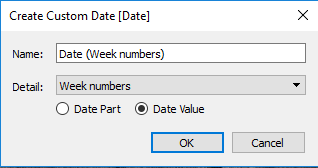
- Created a custom date part for the just the week. Tableau makes this incredibly easy, not even a calculation to write.
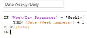
- From here, just a short calculation to control the Parameter for Daily/Weekly
I like that this gives an answer to ‘should i buy or sell?’ But, I felt it’s still a bit of exploration to figure out the buy/sell – both are red; I’d like the decision to really stand out for the user. Here’s what I quickly came up with as an alternative: