
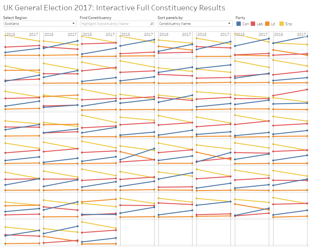
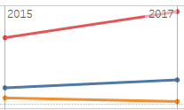
Week 26’s challenge from Emma was a really fun one, and for me expanded my knowledge in very valuable ways. The premise for the week’s challenge was to visualise (British English just in time for the fourth ;)). The overall goal was to create a Trellis chart for each of the Constituencies in each region, and to show the change in overall share by party from 2015 to 2017. Where the challenge really had me thinking I’d get stumped was on the sorting. I’d never implemented a parameter to sort Trellis charts based on the selection, but was ready for the challenge. Here’s the final outcome. Keep reading for how I solved some of the challenges. If you’re new to small multiples/Trellis charts, there’s plenty of resources out there, including the post Andy Cotgreave wrote in 2011.
A few things I’d knew I’d have to solve for:
- data prep
- sorting
- highligting
Data Prep
This was the first #WorkoutWednesday that I’ve done that required some data prep. I’m not opposed to this, it certainly does make it more ‘real-world’. My gripe would be that it’s harder to recreate the exact image as the original when using (potentially) different data. In this case, I really cheated and didn’t perform much data prep. I simply used Excel (I know…) to combine the two different files into one sheet to bring into Tableau. Obviously a myriad of ways to achieve this end, I just wanted to get going on the visualization. I even briefly considered some pivoting within Tableau, but stuck to a straightforward approach.
*Only at the very end did I realize that to match Emma’s example exactly, I’d have to have done a bit more prep with the data. My downfall led to me not having the Party as a Dimension, therefore the ‘Snp’ label is always visible, whereas in her’s it’s only show when Scotland is selected. I’d still felt I achieved the goal, and at 1 in the morning I was too tired to start anew.
Sorting
This is what I was most excited for… sorting small multiples. To achieve sorting, I placed [Constituency Name] on the Detail card and created a Sort By Measure as shown:
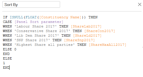 . Tableau helped me out a bit here. I was unsure how I’d sort by just Constituency Name being that the Share calculations for each party resulted in a mixed data types and not allowed by Tableau. By sorting the Constituency Name by the Sort By, it turns out Tableau seems to ignore the Sort By and defaulted to sorting by name alphabetically when selected. I’ll need to study this more, but for now, Tableau FTW.
Highlighting
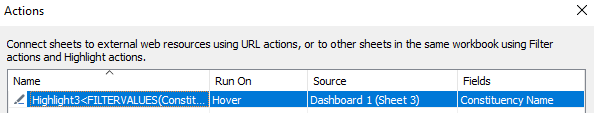
Here’s a great example of something I’d used, being used differently than I’d used it, and leaving me for a bit quite confused how to achieve. In Emma’s dashboard, when you would hover over each Constituency in the list, it would highlight just that cell. It had to be a filter, right? No. Well how’d she get the list.
My mistake here was attempting this at the worksheet level, not the dashboard. Once I was working on the dashboard, this all made sense.
Once I had it all together, I was ready to publish. Until I caught one final trick Emma had used. As I went about my formatting, removing the row dividers and such, I left the column divider on. Except, I had space left on each side, where as her’s filled the entire cell.
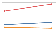
compared with
Reference lines! Which was such a help for me as I was putting the labels on. I wasn’t sure how she got 2015/2017 across only the top cells, but adding the reference lines immediately made it clear. Nice challenge, Emma. I can only hope to be as successful on Week 28 as this challenge. Cheers!