
My third #WorkoutWednesday ever, yet the 13th of 2017, gave me such excitement at first glance – I was sure I could nail this one in an hour’s time. The author’s comment “[t]his shouldn’t be too terribly challenging” boosted the confidence. It still knocked me around a bit.
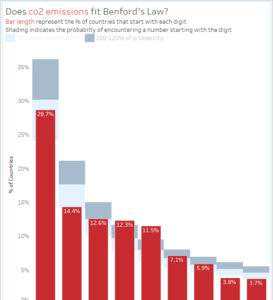
The full details of the challenge are at vizwiz.com, the short of Benford’s law is that the distribution of the first digits of real-world numbers are not evenly distributed. Meaning, the numbers 1-9 are not represented equally as the leading digit in a number. Reading it, processing it, it was a quick “well, of course!” Identification numbers, account numbers, etc – you start with 1 and count up!
The requirements, and my initial thoughts on the challenge:
- Data should reflect 2010 only easy – filter
- User should be able to pick between the eight metrics you see listed easy parameters and calculated fields
- Zeros and nulls should be excluded check!
- Match my title and subtitle exactly no problem
- Match my colors throughout hmmm … these don’t appear standard, what’s going on in the probabity coloring…
- Each bar represents the % of countries that end with that number for the metric selected ok
- No tooltips sure
- Labels for the bars should be on the inside-top of each bar yea, I’ve seen this before, time to turn on the memory bank
- The lighter blue bars behind the red bars indicate the “expected” outcome of Benford’s law. Notice those don’t change even when the user changes the metric. still hmmm, obvioulsy dual-axis
- Dashboard layout is 800×600
- You cannot use LOD expressions wasn’t planning to… is this where most would start?
My first go at it resulted in this chart:

This involved:
- CASE statement to get the Parameter to read between the selections
- taking the LEFT most character (after converting to STR)
- multiplying Birth Rate * 100 (as it’s a percent)
- looking up how exactly Benford’s law is calculated – hello Wikipedia
- calculating the probability for numbers 1-9, plotting on a second chart with reference bands, combining both as a dual-axis, and synchronizing the axis
Where I’m left:
- why did I have a mark that has to show for the reference bands and Andy doesn’t?
- how did he color the reference bands?
Another 30-40 minutes, and I didn’t care to create a custom color palette, not one utilizing Facebook’s guidelines at least. More importantly, I figured out the way to handle the reference bands without a second chart.
Here it is (tablet version to fit embed – full version):
Other changes I made:
- tablet layout
- controlled the tooltips via parameters rather than in the workbook/dashboard
- changed the layout and parameter control for the tablet layout