Browsing Tag:

Workout Wednesday

In Data Visualization on
August 19, 2017

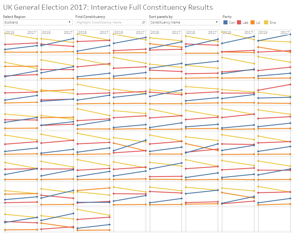
Week 33 brought forth the challenge of moving the reference date for a Percent Change calculation based on a parameter. Along the way, VizWizBI put in the usual hidden gems and stumpers. The inspiration came from Curtis Harris.

For me, it’s nice to see when I get to the end result and I’ve achieved the same result as the designer of the challenge via different means/methods. I’m not always as efficient, but it certainly proves I’ve not just copied someone else’s work!

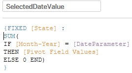
First, I needed to figure out the value at the selected parameter date. Here’s where I fumbled the most to start. Eventually I landed on an LOD that got this for me.

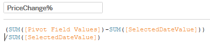
From there, some simple math to get the Percent Change

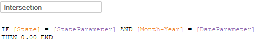
Reference lines gave me the intersection lines, and I got the dot at that point with this

And here it is!

Cheers!

In Data Visualization on
August 11, 2017

Workout Wednesday Week 32: Continuous Dates

This week’s #WorkoutWednesday challenge (available here) from @EmmaWhyte involved continuous dates. Per usual I figured this to be an easy solve, one that I nearly wanted to give up on, and then all at once the light bulb goes off and we’re rolling. Here’s my solution and the necessary solves.

The tricky bit with continuous dates is that, by their very nature, they move along a continuous line, but the example workbook has them stacked as discrete date parts would be. First thought here, and Year([Order Date]) to color and we’re off. Good start, next add Month([Order Date]) to Columns, switch to Discrete… and fail. Because I’ve got a Discrete Date part on color, it’s segmenting into 4 parts, not stacking. To the drawing board…

The solve here was to create a custom date whereby we ‘trick’ Tableau into putting all into the same year, and because we have the Year on color, it segments into 4 lines. Here’s my custom date (you could pick any year):

DATE("1900-"+STR(MONTH([Order Date]))+"-"+STR(DAY([Order Date])))

The remaining work was rather straighforward (so I found at least), you’ll have to add back the year for the tooltip in a separate calculation, which I did like this:

DATE(STR(YEAR([Order Date]))+”-“+STR(MONTH([Order Date]))+”-“+STR(DAY([Order Date])))

I may have ‘cheated’ as I put my title into a separate sheet and combined in the dashboard, whereas Emma had the title in the same sheet. I find this to be the beauty of the product and challenges is, as with programming, there isn’t one ‘right’ solution – but there may be better/worse ways of arriving at the end goal.

In Data Visualization on
July 3, 2017

Workout Wednesday Week 26: Small Multiples + Sorting

Week 26’s challenge from Emma was a really fun one, and for me expanded my knowledge in very valuable ways. The premise for the week’s challenge was to visualise (British English just in time for the fourth ;)). The overall goal was to create a Trellis chart for each of the Constituencies in each region, and to show the change in overall share by party from 2015 to 2017. Where the challenge really had me thinking I’d get stumped was on the sorting. I’d never implemented a parameter to sort Trellis charts based on the selection, but was ready for the challenge. Here’s the final outcome. Keep reading for how I solved some of the challenges. If you’re new to small multiples/Trellis charts, there’s plenty of resources out there, including the post Andy Cotgreave wrote in 2011.

Read more

In Data Visualization on
June 1, 2017

Workout Wednesday Week 22: Wine Tasting

After a few weeks of Andy Kriebel rocking my attempts to easily conquer #WorkoutWednesday, I’m back this week and sucessfully took on Emma’s Week 22 challenge of recreating this viz she found in the Economist.

The trickiest bit here for me was the aliasing of ‘Correct’, ‘Partially Correct’ and ‘Incorrect’. I solved this by adding an extra whitespace to the end of each alias value, but this could have been accomplished as Emma did (as I found out by downloading her workbook) by creating two different calculations. Easy night, I’m satisfied!

Here’s the embedded Tablet View, and the full version can be found on Tableau Public.

In Data Visualization on
May 5, 2017

Tableau Workout Wednesday Week 17 via Microsoft Power BI

Last night I completed the #WorkoutWednesday challenge for Week 17 using Tableau. Having started to experiment with Microsoft Power BI, and joining up with some user groups, I thought I’d see how my skills were progressing in the newest tool.

Quickly I found I still needed a bit to learn, and the requisite Google (perhaps I should have used Bing) of how to do Level of Detail calculations in Power BI didn’t turn up useful answer. Power BI uses DAX (data analysis expressions) to calculate measures and columns. Initially I just knew there had to be a way, there were way too many functions available to not be able to achieve this. In fact, I knew this was going to be easy, and again shock me at how great a product Power BI is, and had been right there all along, just waiting for me to pick it up and try my hand at it.

Read more

In Data Visualization on
April 22, 2017

Workout Wednesday Week 16: Bollinger Bands

Ahhh, week 16’s challenge takes me back to my early days with Tableau. My eagerness to master Tableau had me watching all of the Tableau-provided training videos. I’d recalled the Bollinger Bands charts from the advanced charting section. I do a bit of financial analysis at my day job, but I’d not yet put one of these to use within Tableau. Knowing fully how well Tableau handles moving averages with table calcs, I figured this to be a breeze.


Read more

In Data Visualization on
April 13, 2017

Workout Wednesday Week 15: LOD and Table Calcs

Finally! A week where I got stumped but for less than 5 minutes. A good feeling, but as Andy says, this week will be “pretty easy”. Easy enough, I suppose; still a good mental workout.

The challenge this week was to create one chart with two representations of data; one using a Level of Detail express and the other a Table Calculation.

I’m writing this post simply off my own work; I’ve not yet dared download Andy’s workbook – I want to enjoy the feeling of conquering this weeks’ challenge before I discover how much more elegantly he solved for this. That’s the fun of these challenges and Tableau – multiple paths to solve for the problem at hand. Read more